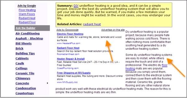
In my last article, i was posted some thick ops.... trick about adsense, there is adsense in blogger post and drop style adsense. It's all about to optimize your adsense for increase a click of your adsense. But, when i read a book about "Adsense Secret", there is a something else about tips for increase a clicks. This tips are about using color to optimize it. So...i call this article is "Using Colors To Increase Clicks".
There is a suggest for your adsense. But the most important thing is your blog/web have a high traffic.Hope this article can help us to get high clicks for our adsense.
Best Regard
One-4-All
1.Design Your Website To Highlight Adsense.
I once went to a fashion show where each model wore the exact same black outfit for the entire duration of the show. Boring? Hardly! The show was intended to showcase platinum jewelry, and the outfits were designed to enhance the jewelry — instead of distracting the audience.
You don’t have to make all the pages on your website identical (or black). But you do want to make sure that the look of your page draws attention to the ads — and makes them appear as attractive and as valuable as platinum jewelry.
Many websites have strong graphic elements that catch the eye — usually at the expense of the AdSense units.
2. Make The Border Gone
Ads with prominent borders make your pages look cluttered. They distract the eye from the ad text, while marking off the ad blocks from the rest of the content.
Google provides an extensive color palette in your administrative area. Use it to tweak the look of your ads to suit your web page.
With just one simple click, you can match the color of your ad's border with the background color of your web page. When the border blends with the background, it frees up loads of space. The page looks instantly neater and the ads look more inviting.
Make sure you also pick a matching background color for the ad. The ad's background must match the page background on which the ad will appear. If the ad appears in a table, match the table background color with the ads background color.
The key is to blend the background and border color with the page, so that the text looks like an integral part of your web content.
3. Text Is Design Too
The text size, font, color and the color of your ads must match the other text elements. If the text color of the ads is the same as the text in the body of your page, it’ll help the ads blend into the site and make the reader feel that you’ve endorsed them. And if the size of the font in the ads is the same as the size of the main body of the content, it will have the same effect: they’ll look like part of your site and not something brought in by Google.
Too many text styles add clutter and can confuse your visitors. Instead, try every legitimate way to make the ads look like a part of your web content. In other words use the colors to make sure that your ads don't look like ads!
There is a suggest for your adsense. But the most important thing is your blog/web have a high traffic.Hope this article can help us to get high clicks for our adsense.
Best Regard
One-4-All


6 comments:
hello.. visiting back friend.. coment in my blog too.. okey..
nice blog
Visit me !!!
good info
nice tips kang...can I ask u something? can U choose one color for my blog!!
This one's interesting.
Great Info.. keep posting
Regards,
Chandu
chandu234u.blogspot.com
Post a Comment